As well as the use of colour in branding, the choice of font is equally important. It is yet another form of non-verbal messaging you are sending out about your brand. Your typographic palette helps to tie all communications together, from the copy on your website, direct mail through to your logo; creating brand consistency and memorability.
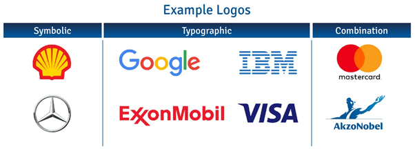
Logos can be divided into three broad yet distinct categories based on the design features used:
- Symbolic logos. Think of brands such as Shell, Mercedes
- Purely typographic logos, for example: Google, IBM, ExxonMobil, Visa etc
- A combination of both ie MasterCard, AkzoNobel

The fact that large corporations simply use typography alone in their logos highlights the impact fonts can have, not having to be used in conjunction with any added symbol or graphic. Instead, the focus is on the form of the letters, the spacing and size. In addition to revealing your company name each of these design elements portray your brand identity and purpose to the target audience in a simple yet memorable way.
A wordmark or font-based logo is most effective when your company name is short, clear and self-explanatory. Referring back to the colour wheel shown in the blog post ‘The Importance of Colour in Branding’, there is only one single use of a symbolic logo, and only 10% are type-only. This is potentially because many of the company names listed are complex or use initials which does not make it instantly obvious what services they offer. This isn’t to say type-only logos are less effective, it is just important to consider what will work best for your brand. Many of these companies have opted to use combination logos to single out the brand among its competitors. In an undifferentiated market this is definitely a wise choice. That said, however, on further observation, there is a lack of differentiation between the type of fonts used. A vast majority have opted for sans serif fonts with only 2% adopting a classic serif font.
In order to understand this a bit more, below is a breakdown of 4 common categories available and their uses:
Serif

Examples: Times New Roman, Georgia
These are basic typefaces with serifs ie extra detailing sometimes called tags or flags. They are the oldest known typeface and therefore more traditional, portraying characteristics such as reliability, being dependable and respectable.
Sans serif

Examples: Helvetica, Arial, Trebuchet
Sans literally means without, so the characters are without the tags. They are neutral and contemporary used to depict simplicity.
Script

Examples: Alex brush, Lobster, Pacifico
Script fonts often look handwritten used to express feeling and creativity. The more curvy and delicate the script font, the more it portrays femininity.
Modern

Examples: Bodoni, Didot
Popular in the 18th and 19th Century these classic fonts are elegant and distinctive representing smartness and intelligence. They are structured and eye catching with by extreme line weight contrast with vertical stress horizontal serifs.
Whilst colours have meanings associated with them, fonts have these personalities, making them a valuable tool to communicate the personification or your brand. However, in order for them capture your brand essence correctly, it is important to understand the font categories, their characteristics and the demographics of your target audience; and not simply pick them because they are just your ‘type’.

