
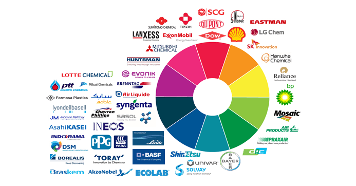
The other week I presented at an international chemical conference and the topic was ‘differentiation in an undifferentiated market’. The main thrust of the presentation was on using customer experience to differentiate in the marketplace. However, since brand and customer experience are so closely linked; after all, the definition of a brand is a promise delivered, I put together the brand colour wheel above that shows the colour associations of the top 50 global chemical companies.
What became very evident is that even from a brand logo perspective, the chemical market is undifferentiated with a lot of ‘blue’!
In any global market it’s not going to be easy to own a brand colour. Yet colour plays such a crucial role in not only the emotions it can deliver but also helping your brand stand out in the market. Market standout isn’t just down to the logo itself but if done right, the colour on its own can deliver competitive advantage to give instant recognition.
Of course, there isn’t one deciding factor in making your brand stand out in a crowded market but colour does play a part. Research has shown that 90% of snap judgements are made on colour alone depending on the product and so if you’re thinking about rebranding or developing a new brand then it might be worthwhile picking a brand colour that does differentiate you from your competitors.
Branding is all about communicating the essence of your company, your products and your services to your own personnel and to the wider world. It is about letting existing and potential customers, and your staff, know what sort of company you are and what they can expect from you. It is an intricate process of combining visual communication with behaviour to create an image in the public domain of who you are.
Far too often, companies approach their marketing and logo creation in a very simplistic way. Many b2b companies spend so much time focusing on second guessing their target market and don’t put enough resource behind market research to find out the market’s view on a brand, what it stands for and the brand personality. Colours can be used to deliver consistency and powerful positioning in logos, corporate marketing, packaging and even uniforms.
What does your corporate brand say to you and your market? Take a look at the colours below and what they stand for:
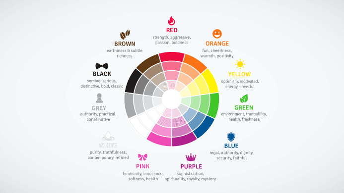
- Red – strength, aggressive, passion, boldness
- Blue – regal, authority, dignity, security, faithful
- Orange – fun, cheeriness, warmth, positivity
- Green – environment, tranquillity, health, freshness
- Pink – femininity, innocence, softness, health
- Yellow – optimism, motivated, energy, cheerful
- Purple – sophistication, spirituality, royalty, mystery
- Brown – earthiness and subtle richness
- White – purity, truthfulness, contemporary, refined
- Black – sombre, serious, distinctive, bold, classic
- Grey – authority, practical, conservative
Colour is ubiquitous but essential in marketing and if ignored can give off the wrong signals. Research has shown that people make up their minds within 90 seconds of their initial interactions with either people or products and over 60% of this judgment is based on colours alone.
With this mind boggling statistic, can you afford to not understand the importance of colours in your marketing and brand strategy?