
A couple of weeks ago we posted a blog looking at tips on how to create impactful market research outputs. While that post focused on the end-product, most often a deck of slides presented to a client at the end of a project with the key findings and recommendations, it got us thinking about the different visualisations used at every stage of a market research project.
As you can expect, market researchers deal with masses and masses of data. To the untrained or less-experienced, the amount of data at our disposal can be overwhelming, and making sense of it all can seem like a daunting task.
This is where visualisation comes in. Presenting the data visually makes it much easier to spot patterns and identify anomalies. However, it isn’t just a case of pasting data into Excel and hitting ‘Insert Chart’. The most effective data visualisations take into account the purpose and goal of the information to determine which format is most appropriate.
This brings us nicely to an article published in the June 2016 edition of the Harvard Business Review, called “Visualizations that really work”. The article looks at two key questions that when answered inform which of four types of visualisation is required.
The first question asks whether the information is conceptual or data-driven. Or in other words, are you looking at qualitative or quantitative information? Ideas or statistics?
The second question asks whether the aim of the visualisation is declaring something or exploring something. Communicating quarterly sales figures to the board, for example, goes into the declaring camp. Breaking these sales figures down by region to see if any offices were underperforming against the average is an example of exploring something.
These two questions are combined to form a matrix with four quadrants. In each quadrant is one of four types of visualisation: idea illustration, idea generation, visual discovery and everyday dataviz.
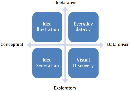
It quickly became clear that we as market researchers can relate to each of these four types of visualisation as they are all used at different stages of the market research process.
Idea illustration
Sitting in the quadrant between conceptual and declarative is idea illustration. This type of visualisation is used to present processes and frameworks with the aim of simplifying an otherwise complex concept.
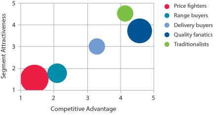
For example, a Directional Policy Matrix might be used at the end of a segmentation study to communicate the most attractive segments to target (and the least attractive segments to avoid). Another example is at the end of a market opportunity study, where the matrix might be used to communicate which markets are worth entering and which aren’t.
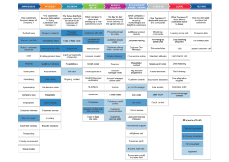
A customer journey map is another example of a market research output which falls under idea illustration. The diagram is used to illustrate every touchpoint of a customer journey and communicate the points at which the customer experience is over or under delivering.
Idea generation
In the quadrant representing conceptual and exploratory is idea generation. This type of visualisation is typically used in group brainstorming sessions to gather as many diverse points of view as possible.
For example, ideation workshops with clients are often used in a product development study to generate new ideas and concepts. These workshops are interactive and use a facilitator to capture thoughts from the group in spider diagrams, thought-bubbles and on whiteboards. As a result, idea generation outputs tend to be unstructured and their form depends on how the discussion unfolds.

Visual discovery
Next up, between data-driven and exploratory, is visual discovery. This is the most complicated quadrant and tends to occur during the analysis stage of a project. Data scientists and analysts will use numerous types of charts and statistical models to mine the data for patterns, trends and anomalies. These charts change often as parameters are adjusted and new data sources are added.
A segmentation study will often make use of visual discovery as survey responses are grouped together and possible customer segments are identified.
Other examples include charting the results from conjoint analysis, SIMALTO and price elasticity analysis to determine optimum pricing.
Visual discovery is most often carried out behind the scenes to uncover the charts used in the following stage.
Everyday dataviz
Finally we have everyday dataviz which sits in the quadrant between data-driven and declarative. These are simple charts and graphs used in presentations and reports to communicate key findings. They consist of line charts, bar charts, pie charts and scatter plots.

Common examples in market research reports include using line charts to look at NPS scores over time and using bar charts to compare familiarity scores for different brands and products.
As this type of visualisation is most often used when presenting the research findings to clients, they need to be easily understood and tell a clear and coherent story.