Brand mapping — also known as correspondence mapping or correspondence analysis — turns survey data into a simple visual that shows how customers perceive your brand versus competitors. It reveals which attributes each brand is most associated with, where competitors overlap, and where whitespace exists for clearer differentiation.
For B2B organizations, where buying cycles are complex and competitive sets are tight, brand mapping gives decision makers a fast, visual view of the market reality.
What Brand Mapping Helps You Understand
-
Your true brand position based on customer associations and experience.
-
How you differ from competitors — or if perceptions suggest you don’t.
-
Which attributes you “own” (e.g., reliability, technical expertise, innovation, sustainability, ease of doing business).
-
Where whitespace exists for repositioning, product development or messaging.
-
Where communications aren’t landing, indicated by mismatched perceptions.
Where B2B Brands Use Brand & Correspondence Mapping
-
Brand strategy & positioning: sharpen your value proposition.
-
Go to market & communications: focus messages on the attributes you can credibly own.
-
Competitive benchmarking: understand who you’re truly competing against and why.
-
Product & service development: identify attributes customers value but don’t associate with any brand (whitespace).
-
Brand tracking: monitor shifts in perception over time, by segment and market.
How Correspondence Mapping Works
Correspondence mapping analyses the relationship between brands and the attributes people associate with them (from your survey data). It plots these relationships as points on a simple two dimensional map:
-
Brands positioned near specific attributes are strongly associated with them.
-
Brands close together share similar perceptions and may struggle to differentiate.
-
Open spaces on the map highlight opportunities to own unclaimed attributes.
We typically use categorical inputs such as brand associations, satisfaction indicators, firmographics (e.g., sector, company size), and brand usage. The output is a visual that’s easy to interpret and act upon — ideal for board level presentations and GTM planning.
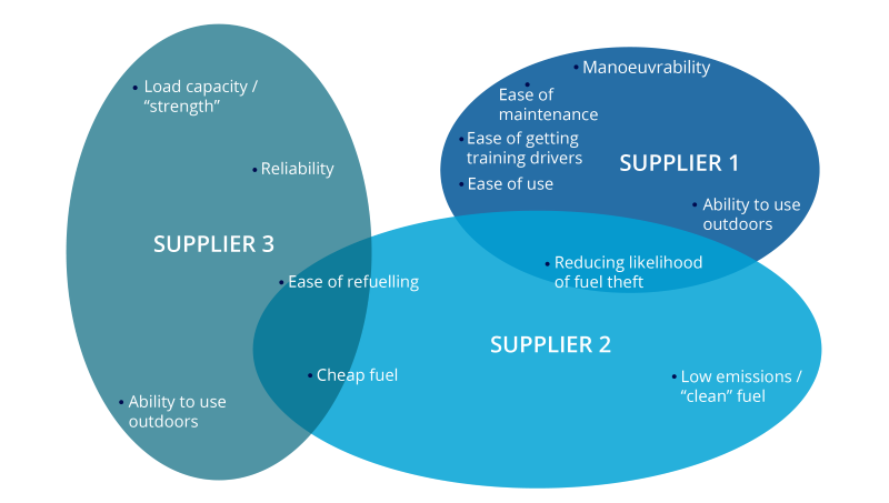
Example: Interpreting a Brand Map
Imagine we survey your customers and prospects across three core competitor brands:
-
Your brand clusters near “responsive service,” “reduces downtime,” “easy implementation.”
-
Competitor A sits near “low cost,” “basic functionality.”
-
Competitors B and C overlap around “innovative” but neither is close to “reliable support.”
What this reveals:
-
You can double down on service reliability and ease — they’re credible strengths.
-
Competitor A competes on price, not service — an opportunity to contrast on value and outcomes.
-
“Reliable support” appears under-claimed by B and C — whitespace for targeted messaging and enablement content.